(This is a repost from a different section of my blog posted last month)
Following a test shoot 2 weeks ago and a tutorial with Diane Bielik, we were reminded that as photographers we are visual people. There is absolutely nothing wrong with planning shoots, refining concepts and evaluation with words but we need to plan visually.
How do you that?
By putting together a series of test images and printing them out! Images behave very differently on the computer screen than on Instagram, your online portfolio or a studio wall. Think about your end result. If your exhibition will be on a wall or in a gallery, it is pointless to have your collection on a folder on your computer and scramble to curate your work on a wall/physical space a week before the exhibition.I was advised to put together a working edit of prints (and negatives) I had from my previous exhibition that has been extended and see how they interact. I will admit, I was very hesitant to do it because it would remind me of how much more work I have to do and improve. I got over myself and did it and the change happened instantly!
Image arrangement 1
Image arrangement 2
Notice how this was arranged, purely on what visually looked good together. I walked away from the wall space, came back 5 minutes later, did some rearranging and then this happened…
Notice how with minimal rearranging, the set of images become more balanced and already the ‘pairs’ or ‘triplets’ that should move together are being formed. I went on to refine this set of images, reject two and note down what the collection need more of but what I learnt was so powerful I had to share. We as photographers are visual people, do not be afraid to do this type of proofing with your series work, the results will change your practice forever.
Beth & Thom Atkinson are a brother and sister in their early 30s who after three quarters of a century, have revealed their mysterious reinterpretation of the effect of the Blitz on contemporary London. They combine aesthetics from old paintings and tell a part fictional narrative of the terror of war on London’s landscape. They aim to preserve the physical and psychological landscapes of the Second World War landscapes in London. According to The Independent, Tonkin (2015), “the Atkinsons uncover… hollow monuments, as sites of memory, and, in Benjamin’s premonitory words, as scenes of a crime.” Beth was educated first as a fine artist and then as a photographer at the Universities of Leeds and royal college of Art respectively.
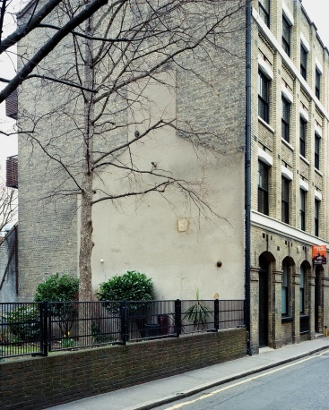
Copeland Road, Thom and Beth Atkinson
Atkinson’s work appeals to me because it is quite simple yet profound. When I viewed these images I was thinking, okay I am looking at buildings, but what is so special about these ones? Then it hit me, when I saw the imprint of a building on a wall and an empty space. Something used to be here and now it’s gone!
They were chosen for my study because I am examining why everyone fears the wave of gentrification that is happening in London and what people do not want to disappear. The threat of something no longer being there draws in documentary photographers, like myself. I suppose it’s the thrill of being a part of history before it has happened. Missing Buildings, is a series comprised of 42 large format photographs and has been presented with other material to create a photobook. This appears to be a long term personal project.
Florence Road, Thom & Beth Atkinson
Over a million of London’s buildings were destroyed or damaged by bombing between 1940 and 1945. Some of the types of buildings ranged from a suburban terrace, to the incongruous post-war inner city estate. Missing Buildings reveals London as a vast archaeological site, which still has the visible scars of its violent wartime past. The artists combined knowledge from books, images and grandparents’ memories to make more than a simple record of bombsites. They retell the story of an epic battle.
Below are my 3 key images for visual analysis.
Hackney Road, Thoma & Beth Atkinson
Image 1 – Hackney Road
This is a road I have passed on many occasions. The lighting in this image creates a silently eerie photograph.
The main focal point is the building with the pink sign but this is overshadowed by the lamppost.
The light appears to be natural (daylight) and quite flat, with the absence of clouds.
This is a typical image by the photographer and lends itself heavily to initial training as a fine artist.
I think it is a successful image with the subject matter clearly indicated by what is in the image (buildings).
The composition of this image is quite interesting. I would have considered the image without the lamppost in the foreground but maybe it adds to the overall narrative.
In addition, the line of the pavement is not directly in the left hand corner but again, these composition choices appear to be intentional.
This image tells a story, but the story is stronger as a series instead of this image on its own.
Dingley Place, Thom & Beth Atkinson
Image 2 – Dingley Place
This is a road I have also passed on many occasions.
The lighting in this image creates a silently eerie photograph.
The main focal point is the building behind the tree, where there is a contrast between the shade of brown and the type of material the building has been made with.
The light appears to be natural (daylight) and quite flat.
This is a typical image by the photographer and lends itself heavily to initial training as a fine artist.
I think it is a successful image with the subject matter clearly indicated by what is in the image (buildings).
The composition of this image is quite interesting and this image tells a story, both on its own and as part of a series.
Brunel Road, Thom & Beth Atkinson
Image 3 – Brunel Road
This is a road I have also passed on many occasions.
The lighting in this image creates a silently eerie photograph.
The main focal point is the building behind the naked tree, it is also interesting to note that the tree is not in front of tall buildings.
The light appears to be natural (daylight) and quite flat.
This is a typical image by the photographer and lends itself heavily to initial training as a fine artist.
I think it is a successful image with the subject matter clearly indicated by what is in the image’s foreground (tree) in contrast to the background (buildings)..
The composition of this image is quite interesting and this image tells a story, both on its own and as part of a series.
Artist processes/materials used
They have used colour film and a large format camera which alters the way the colour scheme the photographs have compared to a DSLR. Traditionally, footage related to the war has been shown in black and white so this is another opportunity to see it in colour. Given that Missing Buildings searches for mythology/strange apparitions as part of its narrative, this blurs facts and fiction and may have been too complicated to produce in black and white.
Key elements taken for my own practise
As a result of looking at Missing Buildings, I will:
Produce an edit of both analogue styled colour and black and white work
Combine other elements into the final story besides photographs
Develop a consistent (fine art) approach both in aesthetics and content
Christian Thompson is a trained sculptor and is one of the first 2 Aboriginal Australians to attend the University of Oxford. His conceptual practice engages a range of mediums including photography, sound, video, performance and music. He holds degrees from: Amsterdam School of Arts, RMIT Melbourne and the University of Southern Queensland. He is represented in state and national collections and has exhibited across Australia, Asia, USA and UK.
Christian Thompson, Australian Graffiti, Yellow Kangaroo Paw, 2007
I encountered this Thompon’s work at Photo London this year and immediately recognised issues of identity and ‘exploration’ through its visual language. He appeals to me because of the uniqueness of his experience as a creative individual and how he unafraid to practice in methods he did not initially train in. Also, he has been able to control his environment (studio photography) and change the element related to the photograph’s title.
I have selected him for my study because my topic is of a slightly personal agenda and I have to strive for this level of clear visual communication, across all my images. Whilst I am not really a studio photographer, I can draw from the technique of maintaining a constant background/setting within my own project. This approach will help me to see if this would make my visual communication clearer.
Christian Thompson, Museum of Others (Othering the Art Critic, John Ruskin), 2016
I am looking at The Museum of Others, 2016, because it is a series on identity with an unconventional approach. Thompson engages with history in a cultural context, combines his biography with research and reflection, emphasises and reveals hidden narratives whilst going deeper than critiquing a museum’s display. He challenges the content of museums on such a topic as well as the process of putting together a body of work on a topic.
Below are my 3 key images for visual analysis.
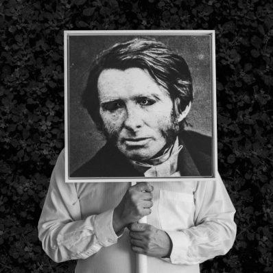
Christian Thompson, Museum of Others (Othering the Explorer, James Cook), 2016
The lighting in this image creates quite a moody atmosphere.
The main focal point of this image is the face of James Cook in the centre.
The lighting of the photograph where the artist is in has been lit in the studio. The canvas panels of the person in question have possibly been painted and so this lighting question would be irrelevant. The light between the two separate parts of the image have been carefully considered so the shoulders of Thompson seamlessly flow into Cook’s despite the outfit change.
This is not a typical image by Thompson. In his previous art work, he has more of his body visibly present, especially his face. In this series, his face is concealed by the person in question and only his eyes come through.
Thompson’s intentions are to dialogue with the assumptions of this explorer who encountered Australia so many years ago and categorise him from a Native Australians perspective then and now.
This image is in square format and has been composed with a strong sense of balance with only the bottom of the image filled to its edge. The foreground is filled with Thompson’s physical presence, the background is relatively empty, leaving room for me as a viewer to consider the texture of the background. It is reminiscent of tree back which implies a sense of nature/natural landscape and how notorious the Aborigines’ people are for living harmoniously with nature.
I think this is a very successful image. The clear content and visual language as well simplicity but ingenuity make it work.
This image tells a very sad story. A story where a British man decided to ‘explore’ a land that did not belong to him in a time where colonialism and imperialism were synonymous with a country’s greatness. This image is the first chance to see through the eyes of the Natives and how it felt to explore the ‘explorer’ who was but a stranger, intending to do them harm.
Christian Thompson, Museum of Others (Othering the Ethnologist, August Pitt Rivers), 2016
The lighting in this image creates quite a moody atmosphere.
The main focal point of this image is the face of August Pitt Rivers in the centre.
The lighting of the photograph where the artist is in has been lit in the studio. The canvas panels of the person in question have possibly been painted and so this lighting question would be irrelevant. The light between the two separate parts of the image have been carefully considered so the shoulders of Thompson seamlessly flow into Rivers’s despite the outfit change.
This is not a typical image by Thompson. In his previous art work, he has more of his body visibly present, especially his face. In this series, his face is concealed by the person in question and only his eyes come through.
Thompson’s intentions are to dialogue with the how this ethnologist classified the Native Australians so many years ago and re-classify him from a Native Australians perspective then and now.
This image is in square format and has been composed with a strong sense of balance with only the bottom of the image filled to its edge. The foreground is filled with Thompson’s physical presence, the background is relatively empty, leaving room for me as a viewer to consider the background. It is of flowers, which implies the importance of the nature/natural landscape and how notorious the Aborigines’ people are for living harmoniously with it.
I think this is a very successful image. The clear content and visual language as well simplicity but ingenuity make it work.
This image tells a very sad story. A story where a British man decided to ‘classify’ a people he had only heard stories of, by biased Britsh men. It also implies a sense of dominance and superiority on Rivers’s part. This image is the first chance to see through the eyes of the Natives and how it felt to classify the differences between the British and the Aborigine’s from a different worldview.
Christian Thompson, Museum of Others, Equilibrium, 2016
The lighting in this image creates quite a moody atmosphere.
The main focal point of this image is the circle in the middle hiding Thompson’s face.
The lighting of the photograph is artificial (studio).
This is not a typical image by Thompson. In his previous art work, he has more of his body visibly present, especially his face. In this series, his face is concealed by a circular object which allows the texture of the background to come through.
Thompson’s intentions are to dialogue with the principle of equilibrium by using a visual and mathematical tool (circle) in the context of identity for the Native Australians. Circles have no beginning and end and in a way, it looks like something has come full circle or will continue to be as it always was.
This image is in square format and has been composed with a strong sense of balance with only the bottom of the image filled to its edge. The foreground is filled with Thompson’s physical presence, the background is relatively empty, leaving room for me as a viewer to consider the background.
I think this is a very successful image. The clear content and visual language as well simplicity but ingenuity make it work. It is the only image where eyes are not present.
This image is quite open ended in contrast to the others in the series. A circle has many uses and is a common symbol for balance, harmony and a cycle.
Artist processes/materials used
Thompson uses a variety of materials to complete this work. He collects a variety of costumes and props and is a bower-bird lover. These props/costumes then feature in the majority if not all, of his work. In addition, this fine art approach was hones by his unique mentor support system. Names such as Marina Abramovic (his mentor) and others who engage in auto-ethnography, research and reflection to interpret historical collections to produce new cultural expressions.
In this series canvas masks were used as a prop and then their eyes were removed and Thompson’s eyes substituted theirs. Information on Thompson’s site about C-type prints implies that these images were shot on Colour (C-41) film, probably large format (studio practice, quite slow) and then processed and printed digitally. They ended up as black and white images and textures were preserved using metallic paper. The square format of the images implies a square medium format camera or severe cropping in post-production reminiscent of the square canvas panels used.
Key elements taken for my own practise
Whilst I am not working in the studio for my project, I will slow down my practise to consider composition even more.
It is okay to take work in colour and print it in black and white. Colour rules are not as rigid as they used to be (i.e. photojournalism or documentary photography in black and white only).
Be very strict in how I present a message so that viewers who do not know what the topic is about can easily guess that from the pictures presented.
Felicity Hammond is a fine artist working with mixed mediums – primarily, photography and sculpture/installation. I had the privilege of meeting her at Photo London earlier this year (in conjunction with The Photographers Gallery). Her series on show was, You Will Enter an Oasis, 2015. This was a photo-sculptural project dealing with the computer generated visions of opulent living and the discarded material that it conceals. Some, if not all of the (concrete) slabs were ‘found objects’ taken from construction sites, the natural elements (leaves, wood etc) were then fused onto it and the final product photographed. The finished product was printed on a surface of Perspex where distortion and warping gave the piece dynamic impact. Her work has won numerous awards/nominations from the following institutions: British Journal of Photography, Catlin Art Prize, Saatchi New Sensations and Magnum/Photo London.
Felicity comes from a very heavy fine art background. Her undergraduate degree was in Fine Art Photography, her MA was in Photography at the Royal College of Art and she is currently working on a PhD in contemporary art research. A lot of the work on her website combines at least two which give her work a conceptual approach. Following which there is a clear process, of making things, (photographing them – if that is what the end result is), and then considering installation.
F. Hammond, Installation, 2015
This photograph appeals to me for 2 reasons. She is a contemporary photographer and her work combines visual art with something tactile (sculpting and installation). An issue which is very dear to my heart has been expressed in a completely different way than I would have thought. It is in colour, Hammond has used sculpture, found objects and no more than 3 types of objects in each image (wood, plant and blocks). Her work has not isolated anyone from the art or photography world which is a sign of this series’clarity and success.
When I entered the room and saw her work I was able to use the items in the picture to hazard a guess at what the work was about. This visual language and visual clarity is something I am striving for in my own practice. Given that Hammond has devoted a lot of her life to visual arts she is able to work ‘quicker’ on great projects than someone who is just entering the professional world of visual arts (like myself).
THE FOLLOWING 3 IMAGES WILL BE USED FOR DETAILED VISUAL ANALYSIS
F Hammond, 2014
IMAGE 1: THE TOWEL
Lighting makes the shadow where the wood is hanging on the rack appear soft but defined. The blocks do not have reflections on them and this image mimics a ‘bath showroom’ image.
This is a successful image, the lines, repeated pattern, muted colour scheme and simplicity work well. The brick in the top right hand side giving the image a sense of something beyond what I am seeing is particularly clever too.
The main focal point of this image is the wood/towel. The use of pattern in lines and object texture cries out to be analysed but not in a competing way – the use of a large depth of field helps here.
The image has been composed in a way which is unusual – the towel/wood is off centre and there is a good amount of foreground/background space.
The lighting setup is most likely even lighting (see diagram below, paired with a white reflector – see the drastic differences)
Hammond’s intention is to address the spatial inconsistencies of simulated architectural propositions and how they materialise in the post-industrial landscape. She has done this by breaking down the heart of what buildings are made of and what they must remove in order to exists.
Looking at Hammond’s galleries of other projects, her stamp is there, in composition, colour palette, way of working and the mediums she employs.
F Hammond, 2014
IMAGE 2: THE BATHROOM
The lighting in this image is identical to its predecessor – even, soft and with minimal shadows
This is a successful image, it looks like a Hammond picture and does not visually stray from the theme of the series or its styling. This image screams nathroom tiles to me becuase of its pattern on the cube. In addition, the material behind the cube combined wiith the cube is what many opulent bathrooms consist of whilst the material on top of the cube has to be removed (clearing the land) in order for this construction work to begin.
The focal point of this image is the grass sprouting from the cube sitting on a wooden surface
This image has been composed using a play on the rule of thirds. There is a shadow behind the focal point of this image as well as a hole on the left hand side of the image whilst the right side of the image has none. The cube is given less monotony with the 4 main lines on its surface.
The lighting diagram mentioned in image 1 was most likely employed here too as well as the intention of this image and series.
Looking at Hammond’s galleries of other projects, her stamp is there, in composition, colour palette and way of working.
Bermuda Grass, F, Hammond, 2014
IMAGE 3: BERMUDA GRASS
This images lighting is most likely the same as its predecessors.
This is a successful image, well executed, looks like part of the overall series and the 2 elements behind the focal point do not detract from it.
The main focal point is the rectangular slap with the grass on top of it
This image has been composed using the rule of thirds for the horizontal arrangement. The distance between the table top and the bottom of the picture was considered in the vertical placing of this object in the image.
The use of (what appears to be art or picture frames) on both corners of this picture make me think of an affluent persons living room – I could be wrong and this may not have been the photographers intentions.
Artist material and processes
Hammond’s end results are printed onto perspex and she works with sculpture, installation, role play and photography. I am inclined to believe that she used a digital camera for photographing these pieces however the colour palette is quite muted so medium/large format colour film could be equally as probable.
On Hammond’s website there are no behind the scene videos or written insight into her materials and processes. From the variety of projects she has up, I can see that she is a very tactile artist and is not afraid to incorporate a variety of mediums from the visual arts world into her work.
WHAT HAVE I LEARNED FROM HAMMOND AND HOW WILL I APPLY IT?
Don’t be afraid to incorporate other mediums into my work. I’ve never sculpted but I have had a hand at drawing and painting, see how this changes my work and the end result and possibly photograph that? Maybe even moving image/sound – just experiment and see what happens!
Visual language, a recurring theme, nevertheless a very important one. Think about the material/signs present in my photography and what they will communicate to my intended audience.
Have a very specific way of working and subject. The ‘boring topic to photograph’ is the easiest to experiment with, because of its simplicity.
Jon Tonks is a British photographer based in Bath, England. His work has been featured in The Sunday Times, The Guardian and FT Weekend Magazines, Monocle, TIME LightBox, the British Journal of Photography etc. He been shortlisted for the Taylor Wessing National Portrait Prize and in 2012 was Judges Choice at the AOP Awards. In 2014, Tonks was presented with the Vic Odden Award by the Royal Photographic Society for his first book Empire, a journey across the South Atlantic exploring life on four remote islands – relics of the once formidable British Empire. The book was hailed by Martin Parr as one of his best books the year.
Tonks was born in Sutton Coldfield in the West Midlands (UK) in 1981, and took his first job as staff photographer on a local Midlands newspaper in 2005. Two years later he undertook an MA in Photojournalism & Documentary Photography at London College of Communication, and now continues to work on his own documentary projects and for a variety of editorial and commercial clients.
This photographer appeals to me because he is a contemporary documentary photographer who has had success both in his commissioned work and commercial work. Traditionally, a documentary photographer is unlikely to be successful at both types of practise. This is evidenced by his book being published, where his work is housed and the competitions he has won or been shortlisted in. Additionally, validation by renowned BJP and a senior person in Magnum Photos adds to his credibility.
Tonks’ work has a clear theme visually and conceptually. Looking at his images, immediately, without reading any additional text I was able to decipher that he was looking at something related to Britain. This type of visual clarity is something I am striving for. His work reads well individually and as a series. Tonks spent 5-6 years documenting this work of personal interest and out of it arose a book, gallery exhibitions and prints. He has other series of work on his site but I will be focusing on his British Empire work.
The following 3 images will be used for detailed visual analysis.
This slideshow requires JavaScript.
Image 1: Nigel Haywood
The lighting in this image playfully creates an air of royalty – mimicking commissioned royal portraits during the reign of the British Empire
I think this is a successful and well executed image. Every detail has been considered – clothing, furniture, wallpaper, decor, the mirror, lighting and accessories. It is a well directed image and the model has a good facial expression and posture.
The main focal point of this image is Nigel Haywood, it is a portrait and he is central in it
The image has been composed using symmetry, Haywood and the mirror can divide the image in half. The ‘busiest’ area of the image is the middle, the foreground is less busy with the background being the quietest area of the image. This had to be carefully considered as stereotypical tools for portraits such as vignetting or wide aperture have not been employed here. Decorations have been employed with the a warm colour palette with reds and white very present in the image.
Natural light may have been used as a filler for this image with flat artificial lighting being employed for visual consistency
The intention of Tonks is to portray an aspect of the British Empire – regal portraits with importance of furnishings, poise and oozing royalty. This is contrasted by the slightly humorous facial expression.
This image is in the distinct style of Jon Tonks. He does project based work in different locations combining landscape, object and portraiture.
I think this is a successful image. Attention to detail was very important in order for this image to work.
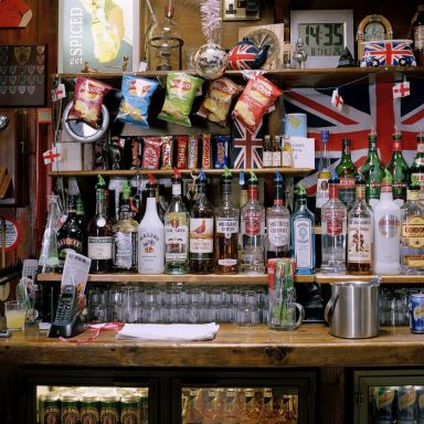
The lighting in this image recreates a British pub interior.
The image has been composed almost like traditional still life images. The detail is in the objects and repetition in the photograph (for example, flags of different sizes in different places).
Artificial lighting was used here
The intention of Tonks is to portray an aspect of the British Empire – a quintessentially British pub and it definitely works.
This image is in the distinct style of Jon Tonks. He does project based work in different locations combining landscape, object and portraiture.
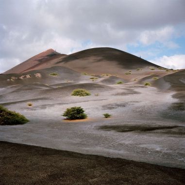
The lighting in this image is different to the others, quite moody and atmospheric.
It is different image to the others preceding, it is not filled with objects/a person but it is still successful.
The main focal point of this image is the clouds with the mountain peak beneath it.
The composition is less traditional, the mountain is not the central focal point with other natural formations present in the foreground of the image.
It appears natural light was the main source for this image
The intention of Tonks is to portray an aspect of the British Empire within this series.
This image is in the distinct style of Jon Tonks. This appears to be an establishing shot as there are no features indicating something ‘British’ other than an implied territory.
Tonks, Italy, no dateTonks, Italy, no date
Artist material and processes
There is no clear description on Tonks website to indicate whether he works analogue, digitally or both. I will be making assumptions based on the aesthetics of his images. The square format, colour palettes and the fact that this was a long term overseas project suggest to me that Tonks was working analogue. Mamiya 6/7 being possible camera bodies although a Hasselblad or any other type of camera could have been used and the images cropped accordingly. When travelling for photography access to charge up camera batteries is not always guaranteed but as photographers work more post 2000s with technological improvements becoming more global this could have changed.
Tonks, colour management, no date
On Tonks website, there are videos and a lengthy description of the printing process, colour management and book printing process. A printing house in Italy is employed, the images are no bigger than 8×10 in the book (confirming my suspicions about them being cropped for online galleries).The colour management software Pantone is employed with the CMYK space (for printing) though compatible RGB spaces have been invented by the said company. The process of printing is a very slow one to guarantee colour accuracy across every piece of finished material.
Tonks, Advice, Italy, no date
What have I learned from Tonks and how will I apply it?
Attention to detail is critical for any successful artiste and I will be ensuring that I am as meticulous with my work from creation to completion.
Clear visual communication – if my idea is about a particular location in London, make sure that the images have key features of it and leave ambiguous features for a series as opposed to standalone and reject images with no message.
Remember to allow space for local people to interact with me (outside of my camera) and photograph what I see around me- not just what I think I am looking for.
Find a lab and stick to it. I love the customer service I have received at Genie Imaging. They have digital and analogue facilities, they do fine art printing, the attention to detail is superb as well as a lot of industry experience so that is where I will be getting my work printed from now on.
I am documenting the regeneration happening in London; it is a current issue; also, an extension of my project from last year (The Lines that Divide)
This will be shot in London – the specific area will be selected as I continue shooting, London is a big place!
Previously, I was using a Nikon Fm10 and Canon AE1. I’ve been challenged this year to see if I could transition my practice digitally to save money. I will decide on using a Canon DSLR very soon but will still try to capture on film as well.
Key influences (I have to select a total of 10) I am currently on 2 – see my previous post Idea Moodboard . Attention to detail RE composition, a deeper meaning in photographs, photographing a popular topic in a unique way.
Creating a moody atmosphere, strong highlights and shadows (heavy contrasts). This will be achieved in the editing – push processing was implemented in the darkroom. This aesthetic will now have to be achieved in the digital darkroom.
None unfortunately! I work with natural light, no flash or additional lighting.
(See image below) as an example from my previous project (which influenced this one) for the type of aesthetic I wish to achieve. Quite moody photographs, coming from a concerned approach so there will not be image/subject objectivity.
Documentary photography – this will cross over into architecture, portraits, city landscape and maybe still life. The images have to have the same look and feel. Nowadays people are less strict about a series containing both colour and black and white images. If this affects the visual authenticity then it this method will be abandoned for a slightly more traditional approach.
10 – 12 images (out of 40-50) from this work will feature in my final exhibition and it may receive press coverage. Newspapers, journalists and other people in the art world will view it. All the pictures from this series will be published in a book. I will make money from it by making a limited edition and keeping numbers very small. This will ultimately impact the way the series is edited and print/publishing decisions.
When coming up with photographic ideas a personal photography brief is always a good starting point. It helps you describe your ideas/how you want your images to look before you have taken them. It can serve as a reminder for what you are doing, how you want to do it and sometimes, why. Once the shoot is over, you can reflect on this document to see what you followed or didn’t follow and why. It helps in your evaluation, and you find yourself growing a lot faster a photographer. Once you move forward from the previous project you become more intentional with how you work.
Sections to break your photography brief into:
Aims & Objectives – what are you doing/going to do and why?
Location – where are you shooting, why? Include sample images here.
Equipment – list here
Influence – who are your key influences and why, what are you taking from their work and injecting into yours? Include every element and use visual language. Include key images here to demonstrate what you wish to achieve.
Light – how should it look in your images, mood and atmosphere you wish to create? How will you achieve it?
Lighting diagram – use it to show your setup and consider your subject and location. Include any good test shots you have here.
Look and feel – how would you describe your images in words – use descriptive vocabulary.
Genre – what genre are you working in – how will this affect the way your work looks visually?
Audience – where do you want your work to end up? Who will view it and how will you make money from this work? Will this affect how you complete your project and the decisions you make?
You don’t have to write paragraphs for any of these sections. aim to answer in bullet points. This will help you absorb what you are doing faster and make planning the consequent shoots/projects easier. I’ve included my example brief in another post.
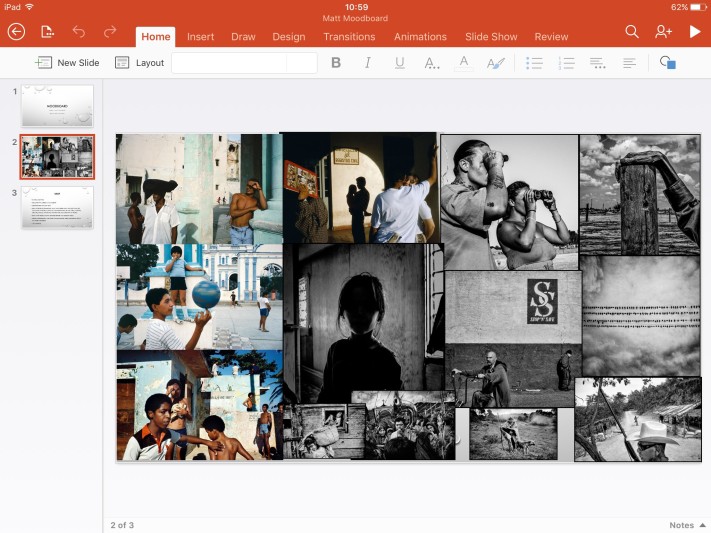
Moodboards are very beautiful things for visual people but sometimes, even these need a bit of moderation. For my Final Major Project (which will be a stepping stone into the photographic industry) I decided to limit my initial moodboard to just 2 artists, yes 2!
Following my summer placement at Magnum Photos, I decided it would be a good place to start. This moodboard incorporates a ‘traditional’ photographer and a contemporary one who work in different ways – colour and black and white but are both documentary photographers who employ location and natural lighting in their work. In addition, they fit into the sub-genre of street photographers. Their names are Alex Webb (the colour photography) and Matt Black (black and white).
(filename is lecturers name – ignore that bit) – picture references available separately
When I was opened up to the influences that Webb had when studying and learning photography (Professional Photography magazine) he studied masters such as Cartier-Bresson who did not work in colour. This was a critical point for me. Whether or not a photographer has the same working practice as you – either in content or aesthetic there is always some principle that you can take away.
I had the privilege of assisting the setup of the New Blood Magnum exhibition and I was immediately drawn to Black’s work. The pictures he had on display were documenting the ‘Geography of Poverty’. For these he used poignant pictures and a key statistic/caption. The way he presents his work and his approach help give this series and unusual and more profound meaning than stereotypical documentations of poverty and hardship so frequently employed.
This moodboard was a good starting point for me because it challenged me to find similarities/differences between two photographers, whether it be in their work, practice, aesthetics or their approach. It allowed me to dig deeper and to challenge the way I work. I would recommend making a moodboard with a limited amount of photographers, artists (whatever it is you are looking at) as a starting point for a new project. It will force your eyes to be opened.
So, the end of the final road begins. These past 2 years have been interesting as a Photography student. When you are completing placements, juggling freelancing and studying it can be hard to juggle all the information that is given to you and process it into something you can actually follow.
There are 3 things that I have learnt that have helped me a lot, they’ve been said over and over again but I don’t think the light fully switched on until final year so I will share them briefly below.
Write down EVERY idea you have. As trivial as this sounds, there will be stages of growth in your development as a photographer. I now look back at ideas I had from the first year that I was not ready to shoot – I didn’t have the technical skills, the creative eye and quite frankly enough industry experience to attempt such a project. Writing it down tells your brain this is something important – not something I will be wasting time by doing and you’ll be surprised how much inspiration you can get after revisiting old ideas.
READ like it’s going out of style! (I will elaborate this one further on in my blog) but when you are not making work, spend time looking at other creative work, journals, photographic magazines that explain how the successful live and think, books, films, paintings even music. You will find that when your reference these creatives in your work, your interpretation of it changes as you add your own flavour to what has been done before you. Saturate yourself in creativity, it helps you become more original.
NEVER be afraid of failure. I cannot stress this last one enough. There will be some projects you try and you take some absolute sh*t pictures (at least I have) but this is all a part of the process. My editing in my early stages of learning Photoshop was poor, and I had to submit some of this work for graded assignments. The feedback I got – though uncomfortable at the time, forced me to improve and to learn from what had gone wrong. It has been quite crazy how quickly the past 2 years have flown by, and I am glad that I attempted and failed the things I did at a time where it was less critical and I had a safe space to ‘fail in’. I can assure you that I’ve not made the same mistakes twice!
This year as I write my blog, I will be including more pictures, personal reflections and sharing tips for those creatives who wish to bridge the gap between student and professional and are unsure of how to go about it.
Welcome to my blog and please, don’t be afraid to leave a comment – I will reply.
Robert Franks retrospective was removed from New York University after Valentines Day this year after being there for at least 68 years. His only piece of advice for the next generation was “Keep your eyes open.”


You must be logged in to post a comment.