Jon Tonks is a British photographer based in Bath, England. His work has been featured in The Sunday Times, The Guardian and FT Weekend Magazines, Monocle, TIME LightBox, the British Journal of Photography etc. He been shortlisted for the Taylor Wessing National Portrait Prize and in 2012 was Judges Choice at the AOP Awards. In 2014, Tonks was presented with the Vic Odden Award by the Royal Photographic Society for his first book Empire, a journey across the South Atlantic exploring life on four remote islands – relics of the once formidable British Empire. The book was hailed by Martin Parr as one of his best books the year.
Tonks was born in Sutton Coldfield in the West Midlands (UK) in 1981, and took his first job as staff photographer on a local Midlands newspaper in 2005. Two years later he undertook an MA in Photojournalism & Documentary Photography at London College of Communication, and now continues to work on his own documentary projects and for a variety of editorial and commercial clients.


This photographer appeals to me because he is a contemporary documentary photographer who has had success both in his commissioned work and commercial work. Traditionally, a documentary photographer is unlikely to be successful at both types of practise. This is evidenced by his book being published, where his work is housed and the competitions he has won or been shortlisted in. Additionally, validation by renowned BJP and a senior person in Magnum Photos adds to his credibility.
Tonks’ work has a clear theme visually and conceptually. Looking at his images, immediately, without reading any additional text I was able to decipher that he was looking at something related to Britain. This type of visual clarity is something I am striving for. His work reads well individually and as a series. Tonks spent 5-6 years documenting this work of personal interest and out of it arose a book, gallery exhibitions and prints. He has other series of work on his site but I will be focusing on his British Empire work.
The following 3 images will be used for detailed visual analysis.
Image 1: Nigel Haywood
- The lighting in this image playfully creates an air of royalty – mimicking commissioned royal portraits during the reign of the British Empire
- I think this is a successful and well executed image. Every detail has been considered – clothing, furniture, wallpaper, decor, the mirror, lighting and accessories. It is a well directed image and the model has a good facial expression and posture.
- The main focal point of this image is Nigel Haywood, it is a portrait and he is central in it
- The image has been composed using symmetry, Haywood and the mirror can divide the image in half. The ‘busiest’ area of the image is the middle, the foreground is less busy with the background being the quietest area of the image. This had to be carefully considered as stereotypical tools for portraits such as vignetting or wide aperture have not been employed here. Decorations have been employed with the a warm colour palette with reds and white very present in the image.
- Natural light may have been used as a filler for this image with flat artificial lighting being employed for visual consistency
- The intention of Tonks is to portray an aspect of the British Empire – regal portraits with importance of furnishings, poise and oozing royalty. This is contrasted by the slightly humorous facial expression.
- This image is in the distinct style of Jon Tonks. He does project based work in different locations combining landscape, object and portraiture.
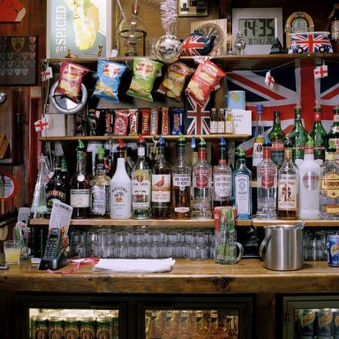
Image 2: Pub
- I think this is a successful image. Attention to detail was very important in order for this image to work.
- The lighting in this image recreates a British pub interior.
- The image has been composed almost like traditional still life images. The detail is in the objects and repetition in the photograph (for example, flags of different sizes in different places).
- Artificial lighting was used here
- The intention of Tonks is to portray an aspect of the British Empire – a quintessentially British pub and it definitely works.
- This image is in the distinct style of Jon Tonks. He does project based work in different locations combining landscape, object and portraiture.
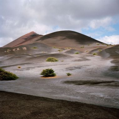
Image 3: Sisters Peak
- The lighting in this image is different to the others, quite moody and atmospheric.
- It is different image to the others preceding, it is not filled with objects/a person but it is still successful.
- The main focal point of this image is the clouds with the mountain peak beneath it.
- The composition is less traditional, the mountain is not the central focal point with other natural formations present in the foreground of the image.
- It appears natural light was the main source for this image
- The intention of Tonks is to portray an aspect of the British Empire within this series.
- This image is in the distinct style of Jon Tonks. This appears to be an establishing shot as there are no features indicating something ‘British’ other than an implied territory.


Artist material and processes
There is no clear description on Tonks website to indicate whether he works analogue, digitally or both. I will be making assumptions based on the aesthetics of his images. The square format, colour palettes and the fact that this was a long term overseas project suggest to me that Tonks was working analogue. Mamiya 6/7 being possible camera bodies although a Hasselblad or any other type of camera could have been used and the images cropped accordingly. When travelling for photography access to charge up camera batteries is not always guaranteed but as photographers work more post 2000s with technological improvements becoming more global this could have changed.

On Tonks website, there are videos and a lengthy description of the printing process, colour management and book printing process. A printing house in Italy is employed, the images are no bigger than 8×10 in the book (confirming my suspicions about them being cropped for online galleries).The colour management software Pantone is employed with the CMYK space (for printing) though compatible RGB spaces have been invented by the said company. The process of printing is a very slow one to guarantee colour accuracy across every piece of finished material.

What have I learned from Tonks and how will I apply it?
- Attention to detail is critical for any successful artiste and I will be ensuring that I am as meticulous with my work from creation to completion.
- Clear visual communication – if my idea is about a particular location in London, make sure that the images have key features of it and leave ambiguous features for a series as opposed to standalone and reject images with no message.
- Remember to allow space for local people to interact with me (outside of my camera) and photograph what I see around me- not just what I think I am looking for.
- Find a lab and stick to it. I love the customer service I have received at Genie Imaging. They have digital and analogue facilities, they do fine art printing, the attention to detail is superb as well as a lot of industry experience so that is where I will be getting my work printed from now on.
References:


You must be logged in to post a comment.